New dashboard feature for Sonru, an automated job interview platform.
Problem
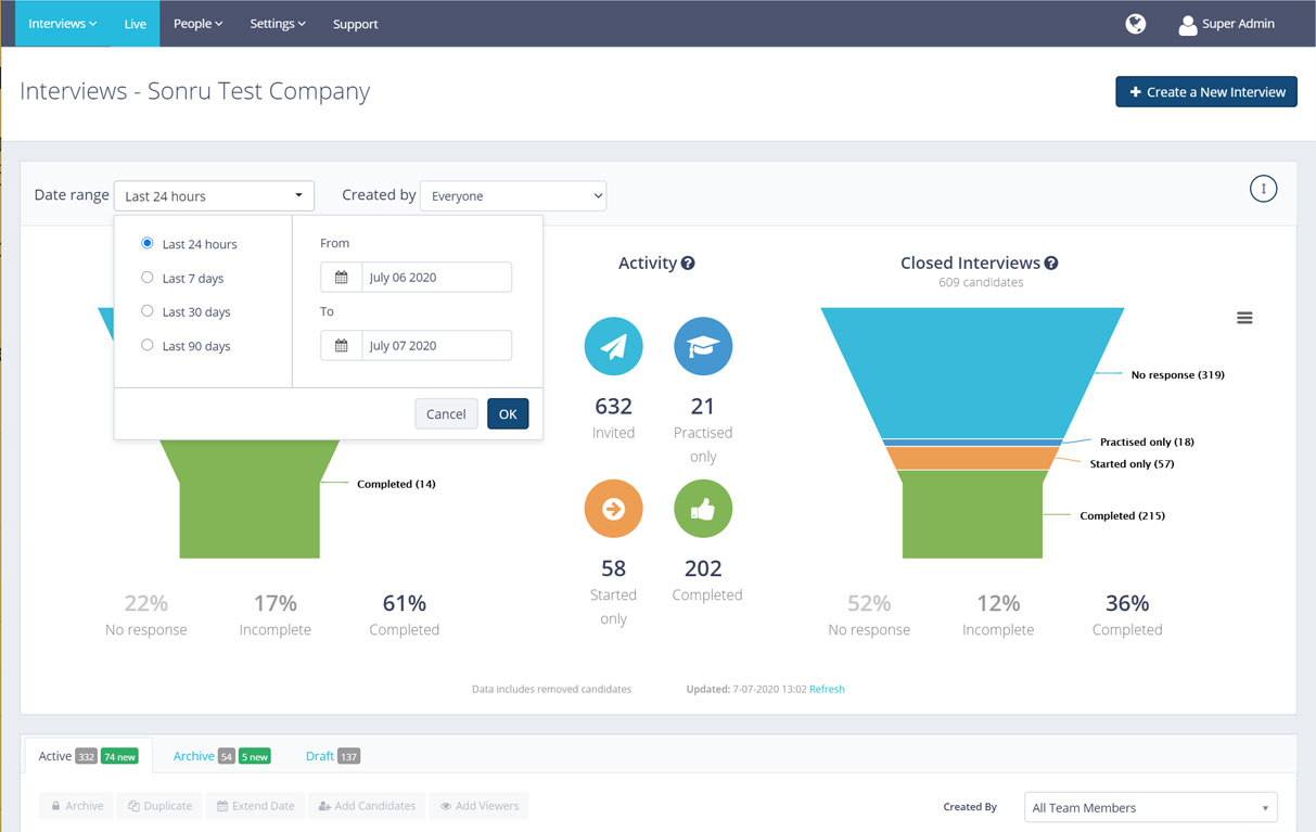
Our customers needed reports to see the success rate of video interview completion but had to request these reports from our CSM team who had to manually generate them.

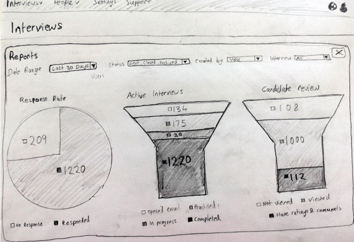
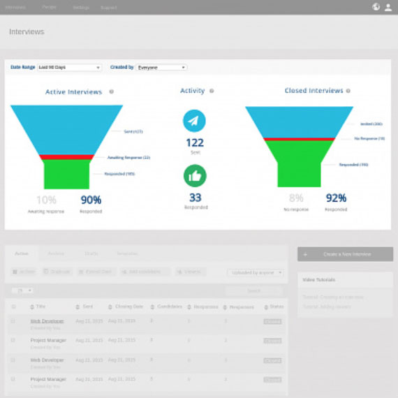
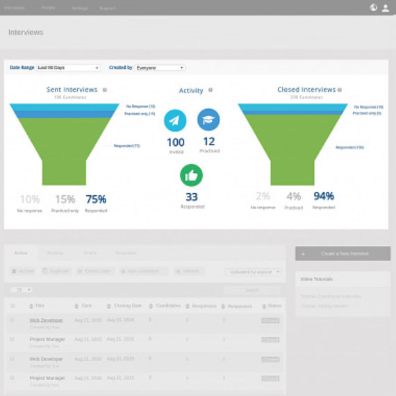
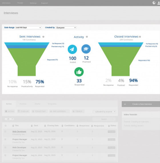
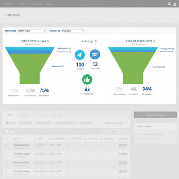
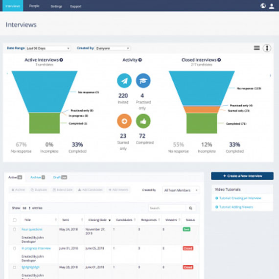
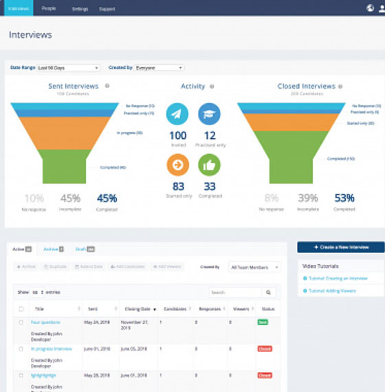
Solution
A reporting panel with a date range filter, showing two funnel charts to indicate success rate, and other vital stats. Resulted in a lot of saved time for our CSM team and customers who were very happy that they could see and manage their own reports from the landing screen.
1. Research
- Stakeholder workshop to gather requirements
- Looking at similar dashboards
- Investigating 3rd party reporting plugins
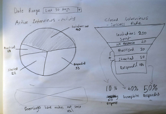
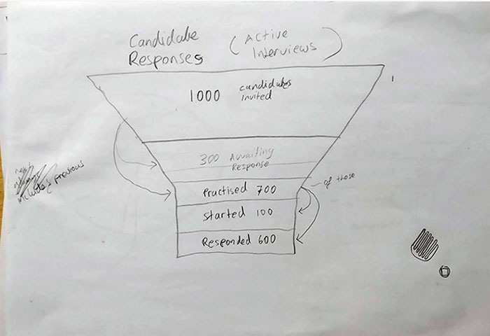
2. Wireframe sketches
Next step was sketching out wireframes, to try and figure out what kind of charts would best depict this data.
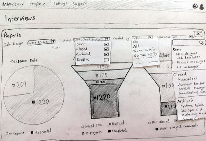
Ongoing feedback from customers and stakeholders was that funnel charts depict the direction of the progress very well. Four filters were out of scope. So we reduced the filters to Date Range and Created By. The crucial part of the feedback was narrowing down the numbers we show to genuinely useful data.

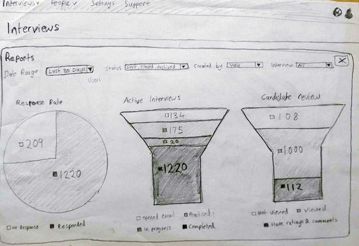
3. Prototyping
I (nearly) always start with greyscale low fidelity prototypes and get stakeholder feedback, and try and nail down the flow and interactions before finally advancing the prototypes to hi-fidelity…
4. Final Design
After releasing to early adopter accounts and getting user feedback, further tweaks were made:
- A button to minimize the whole panel.
- Extra info at bottom.
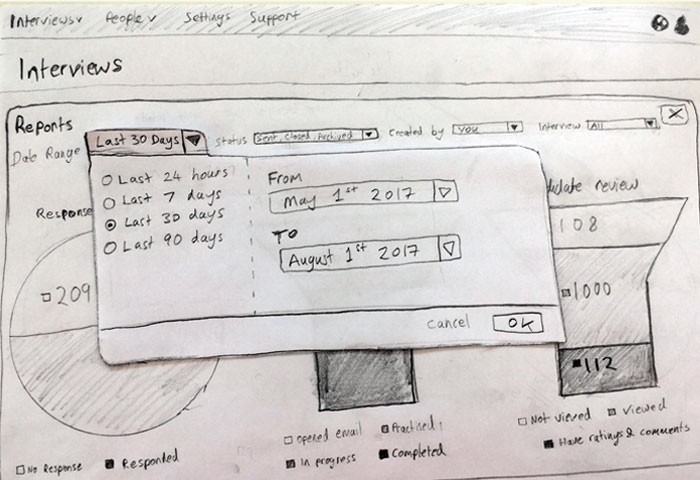
- Tweaks to the date range picker.